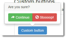
Bootstrap Popover confirm box or information box with custom button with pop out
On click of action button this opens up popover confirmation box instead of conventional dialog box in bootstrap, which is quick and easy way of taking confirmation from user on any specific action and popover box takes less space on screen.
CSS
The plugin uses the default popover styling Bootstrap provides.
JS Dependencies
- jQuery >= 1.9.0
- Bootstrap Popover 3.x.x (included in bootstrap.js)
Let’s go!
Download bootstrap-confirmation.js and include it after jquery.js and bootstrap.js.
src="path/to/jquery.js">src="path/to/bootstrap.js">src="path/to/bootstrap-confirmation.js">
Usage
Enable confirmations via JavaScript:
$('#example').confirmation(options);Recommend way to use:
$('[data-toggle=confirmation]').confirmation(options);Declaration order
Confirmation tries to cancel the default event of the target and trigger it when the “Ok” button is clicked. However, in order to have the good behavior, the plugin must be initialized before manually attaching event listener (with $.on()).
If this is not possible, you could listen the confirmed.bs.confirmation or use the onConfirm callback.
About links
If Confirmation is attached to a <a> tag, the href attribute will be removed and moved to the “Ok” button.
Options
Options can be passed via data attributes or JavaScript plain object. For data attributes, append the option name to data-, as indata-btn-ok-class="".
All options from Bootstrap Popover can be used except content.
| Name | type | default | description |
|---|---|---|---|
| title | string | function | ‘Are you sure?’ | default content value if title attribute isn’t present. |
| singleton | boolean | false | Set true to allow only one confirmation to show at a time.When the newest confirmation element is clicked, the older ones will disappear. |
| popout | boolean | false | Set true to hide the confirmation when user clicks outside of it.This will affect all confirmations that use same selector. |
| btnOkClass | string | ‘btn-xs btn-primary’ | Class of the “Ok” button. |
| btnOkIcon | string | ‘glyphicon glyphicon-ok’ | Icon class of the “Ok” button. |
| btnOkLabel | string | ‘Yes’ | Label of the “Ok” button. |
| btnCancelClass | string | ‘btn-xs btn-default’ | Class of the “Cancel” button. |
| btnCancelIcon | string | ‘glyphicon glyphicon-remove’ | Icon class of the “Cancel” button. |
| btnCancelLabel | string | ‘No’ | Label of the “Cancel” button. |
| onConfirm | function | $.noop | Callback called when the “Ok” button is clicked. In data-on-confirm you can give the name of a function likemyConfirm or myObject.confirm. |
| onCancel | function | $.noop | Callback called when the “Cancel” button is clicked. In data-on-cancel you can give the name of a function like myCancelor myObject.cancel. |
Data attributes for individual popovers
Options for individual popovers can alternatively be specified through the use of data attributes, as explained above.
Methods
.confirmation(‘show’)
Reveals an elements confirmation.
$('#element').confirmation('show');.confirmation(‘hide’)
Hides an elements confirmation.
$('#element').confirmation('hide');.confirmation(‘toggle’)
Toggles an elements confirmation.
$('#element').confirmation('toggle');.confirmation(‘destroy’)
Hides and destroys an element’s confirmation.
$('#element').confirmation('destroy');Events
All events from Bootstrap Popover are available but suffixed with bs.confirmation.
| Event Type | Description |
|---|---|
| confirmed.bs.confirmation | This event is fired when the “Ok” button is clicked. |
| canceled.bs.confirmation | This event is fired when the “Cancel” button is clicked. |
Website: http://mistic100.github.io/Bootstrap-Confirmation/


Recent Comments